ElevatedButton :
An elevated button is a labeled child displayed on a Material widget whose Material.elevation increases when the button is pressed.
Buttons in applications are provided to add actions and functionalities.
- The constructor of the elevated button gives an idea of its functionalities and is shown below:
const ElevatedButton(
{Key? key,
required VoidCallback? onPressed,
VoidCallback? onLongPress,
ButtonStyle? style,
FocusNode? focusNode,
bool autofocus = false,
Clip clipBehavior = Clip.none,
required Widget? child}
)
Example :
import 'package:flutter/material.dart';

void main() {
  runApp(MaterialApp(
    home: Scaffold(
      appBar: AppBar(),
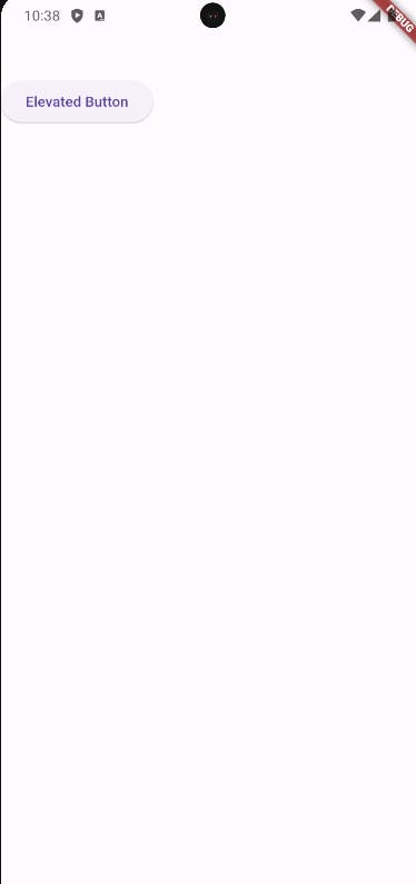
      body: ElevatedButton(onPressed: () {}, child: Text('Elevated Button')),
    ),
  ));
}
Output :

Example :
import 'package:flutter/material.dart';

void main() {
  runApp(MaterialApp(
    home: Scaffold(
      appBar: AppBar(),
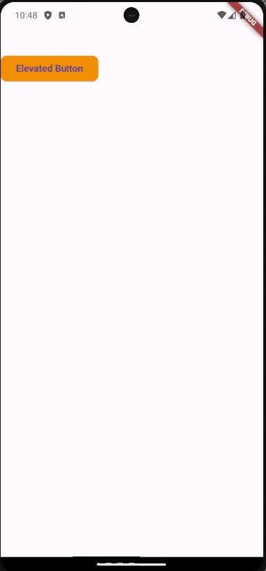
      body: ElevatedButton(
        onPressed: () {},
        style: ElevatedButton.styleFrom(
            backgroundColor: Colors.orange,
            shape: RoundedRectangleBorder(borderRadius: BorderRadius.circular(10)),
            textStyle: const TextStyle(
              fontSize: 15,
              fontWeight: FontWeight.bold,
            )),
        child: const Text('Elevated Button'),
      ),
    ),
  ));
}

flutter widgetFlutterFlutter ExamplesFlutter WidgetsflutterFlutterframeworkframeworksFlutter SDKwidgetsFlutterTutorial, CrossPlatformAppDevelopment, FlutterSeries, MobileAppDevelopment, FlutterUI, FlutterAdvantages, NativeFeel, CodeOnceRunEverywhere, FlutterFramework, GoogleFlutter, DartProgramming, UIWidgets, FlutterAnimation, FlutterWidgets, FlutterPerformance, FlutterApp, FlutterDevelopment, FlutterCoding, MobileUI, WebUI, DesktopUI, FlutterBeginner, FlutterAdvanced, FlutterTipsAndTricks, FlutterCommunity, FlutterLearning, FlutterApps, FlutterProjects, AppDevelopmentTutorialDevopsDeveloperDevops articlesflutter-elevatedbutton-widget

